E.T. Returns Postmortem(ish) Part 2: Visual Design
If you haven't read it yet, I recommend checking out Part 1 of my E.T. Returns Postmortem(ish) first.
WHAT WORKED AND DIDN'T WORK WITH MY VISUAL DESIGN CHOICES?
When I first set out to make E.T. Returns, I wanted the game to be immediately recognizable as a direct descendent of the Atari 2600. To attain this, I established some visual design limitations early on in hopes of creating a "2600" aesthetic.
1. I would work with a 160x105 pixel resolution used in the original 1982 E.T. game.
2. Whenever possible, I would use original Atari 2600 game sprites.
3. I would avoid visual effects that weren't possible on the 2600 (in other words, no screenshake or crazy Unity particle effects).
I threw out rule 1 almost immediately. I wanted to make a fast-paced, frenetic game packed with potentially hundreds of onscreen enemies. This didn't work well in a small screen space designed for 4:3 aspect ratio CRT televisions of the '80s. I quickly moved to a more modern 1920x1080 aspect ratio that would not only give me plenty of room to pack the screen with content but would simply look and feel better on a modern machine with a widescreen display.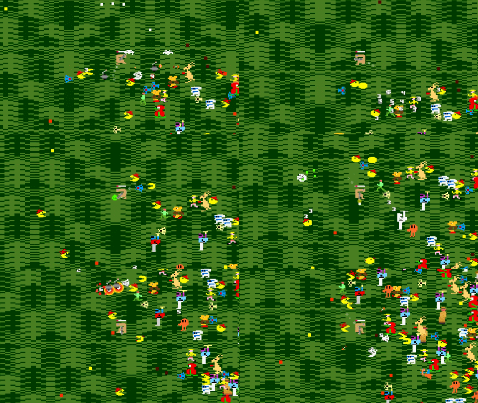
After a few days of prototyping, I also tossed out rule 2. Using the original 2600 sprite art is a fun idea, but I quickly ran into issues. The Atari 2600 has a limited palette that consists of 128 colors. If you've played a lot of 2600 games, you know that the palette is heavily populated with many subdued and muted color variations. When a bunch of 2600 art is combined from multiple games, you end up with conflicting color schemes and a jumble of "pea soup" green and "sweet potato" orange. This was not the look I was going for.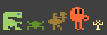
Instead I compromised. I decided to retain the pixel shape of the Atari 2600 sprite whenever possible and then recolor the sprites using alternate source material such as the box art or the arcade version of the game. I started with E.T. himself. I ditched the Atari 2600 "seasickness" green (seen above) and recolored the E.T. sprites using something more in line with the movie version of E.T. This immediately felt like the right direction.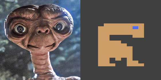
For any game that had an arcade version, I leaned into the more vibrant, diverse color palette that was almost always seen in the arcade release. For example, with Joust I kept the shape of the Atari 2600 sprite, but recolored the pixels using the arcade palette.
For some games, I did eventually tweak the sprite shape itself to bring out more character or personality. For example, with Frogger I merged the 2600 and arcade sprites into a new hybrid sprite. The rich green limbs, yellow torso, and bright pink eyes of the arcade version result in a Frogger that feels alive and filled with character. In contrast, the monocolor 2600 version feels lifeless and robotic. My new hybrid sprite was able to capture the pizzazz of the arcade sprite, but it wasn't so distant from the 2600 version that it felt out of place.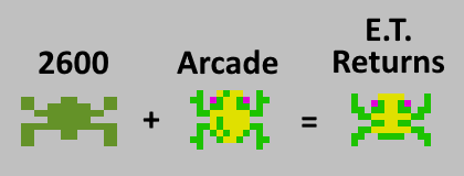
In some cases I straight up pulled an audible. The Atari 2600 Pac-man sprite has never been one of my favorites (not sure potato-face Pac-man is anyone's favorite). I ditched it completely, and I built a new Pac-man sprite using the Atari 2600 Ms. Pac-man sprite as my starting point. The result speaks for itself.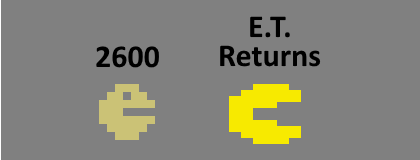
Another problem I ran into is sprite scale. E.T. Returns uses characters and sprites from over 2 dozen 2600 games. Many of these sprites have a fair amount of variation in their base scale. Initially I was scaling all sprites by 4x so that the entire game had a uniform sprite scale. Eventually, however, I was pulling in sprites with noticeable size variation at their base 1x scale. This all depends on how the sprite was originally intended to be rendered on the screen. Some are large, some are small, some are right in the middle. If I used a uniform in-game scale some characters would appear much larger than others. E.T. and Q*Bert look great, but Frogger and Indy are much smaller at their base 1x scale. 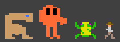
As a result, the in-game sprite art is scaled non-uniformly. I use 4x scale whenever possible, but in some cases I'm also using 5x, 6x, and even 8x (for Indy) scales. If you've worked with sprite art, you know that this is less than ideal. Non-uniform sprite scaling results in higher scaled sprites looking chunky or blocky. Ideally, I would have taken the time to redraw the raw sprite assets so that they all were structured with the correct relative sizes at their base scales. Then I could have used a uniform scale throughout the game. I'm not sure this is going to be noticed by many players, but it does bug me, and if I had a few more days, I likely would have cleaned this up.
For rule 3, I mostly stuck to my guns, but I'm not entirely sure this was the right decision. For the most part, E.T. Returns has very limited visual effects. I did end up creating some very simple particle effects. I didn't use the Unity particle system (which was one of my goals), but instead I created a pool of particle objects that I could spawn with set colors, scales and velocities at different points on the playfield. This allowed me to make a blood effect when an enemy is hit or destroyed, a small explosion when the Scientist is killed or the TNT Slime attack hits an enemy, or even dust particles when E.T. walks. It's something, but it's very minimal.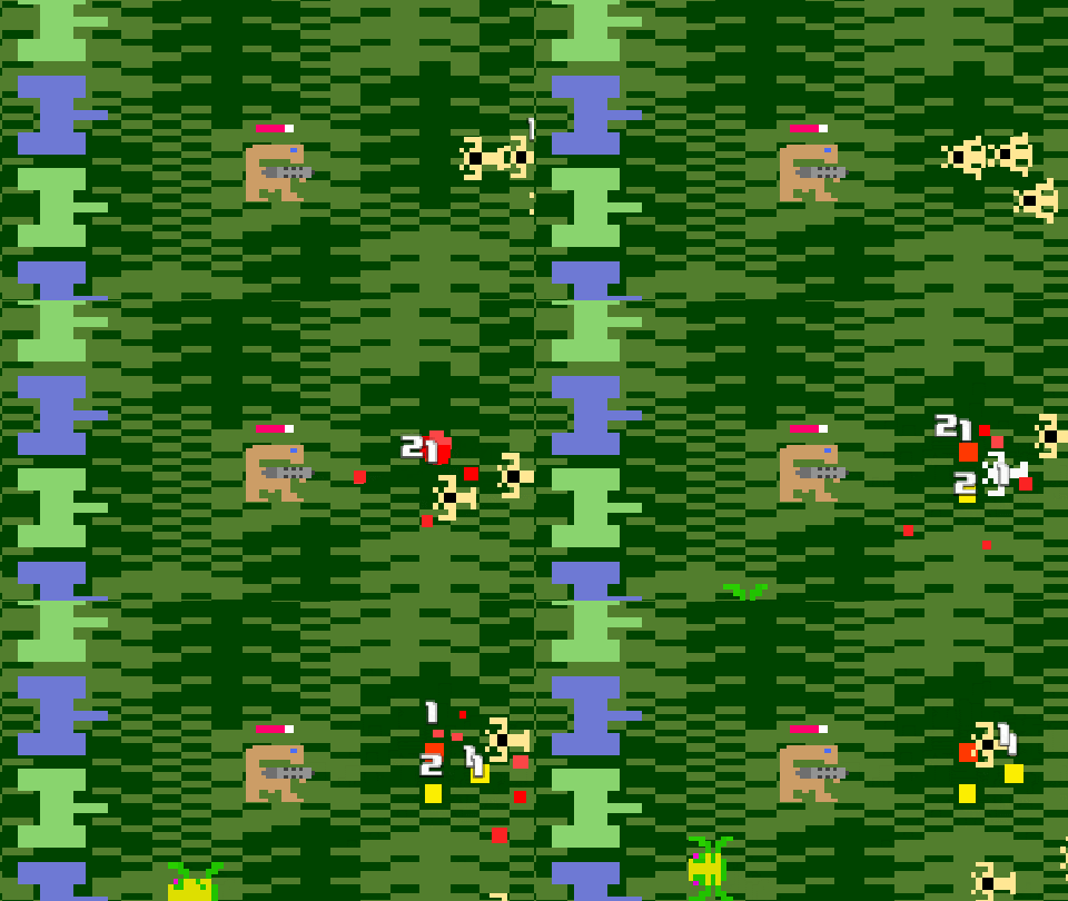
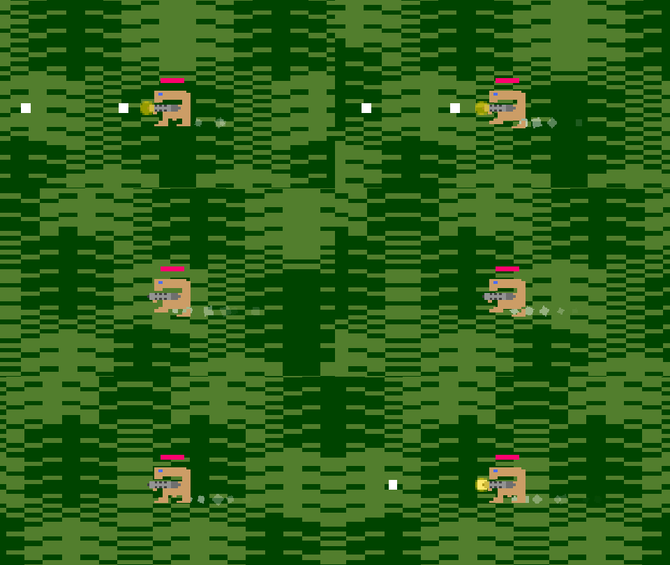
E.T.'s attacks contain almost NO visual effects or juiciness. No particles, no trails, no hit impact. Just projectiles that move from point A to point B. One of the last attacks that I implemented was the Breakout Ball. For this attack I implemented a fading trail effect. It's kind of nice, right?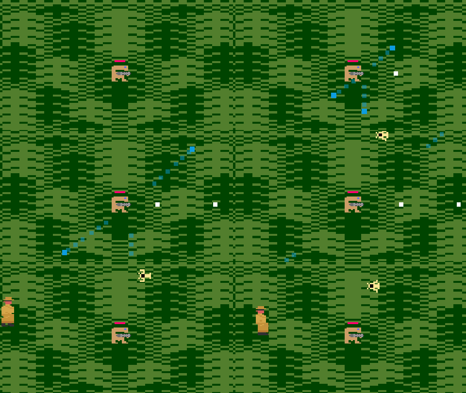
However, I didn't take the time to dig back into the other attacks and give them a makeover with additional visual effects. Honestly, I think I should have embraced a juicier approach for E.T.'s attack. After abandoning the other design constraints, I stubbornly stuck to this one at the expense of visual flair and impact. Some of the attacks lack the sort of OOMPH that really would have helped them stand out - especially at the later stages of the game where the odds are overwhelming and the attacks are quite powerful. I've watched Juice It Or Lose It and The Art of Screenshake enough times to know better! This was really a missed opportunity that, if time permits, I might circle back and address in a future version of the game.
Overall I'm happy with the visuals of E.T. Returns. Obviously, as with all short development periods, there are things I wish I had done better. In the part 3 I'll talk about one of the trickiest part of the game: enemy attack patterns. Onward!
TL;DR: I'm happy that I used a widescreen layout and recolored and reworked sprites. I wish I would have used uniform sprite scaling and leaned more into visual effects - especially on the attacks.
Get E.T. Returns
E.T. Returns
E.T returns... with a laser cannon
More posts
- E.T. Returns update with new retro charactersApr 01, 2025
- E.T. Returns update with more playable charactersSep 19, 2023
- E.T. Returns update featuring new anti-heroesSep 06, 2023
- E.T. Returns Postmortem(ish) Part 3: Attack PatternsJul 07, 2023
- E.T. Returns Postmortem(ish) Part 1Jun 24, 2023
Leave a comment
Log in with itch.io to leave a comment.